Analyzing Hass
b_analyze-hass.RmdThe {avocado} package provides a weekly summary - starting from January 2017 through November 2020 - of Hass Avocado sales. There are three datasets in this package and let’s start with the dataset hass which focuses on weekly avocado sales in various cities/sub-regions across various regions (as defined by the Hass Avocado Board) of the contiguous US. The region variable in the hass dataset can be ‘merged’ with the hass_region dataset using the region variable in both. Do note that the location variable only consists of a sample of cities/sub-regions found within respective regions. Therefore, the totals in this dataset will NOT equal the totals found in the hass_region dataset.
Let’s start by loading the package - along with {dplyr} (for data wrangling) and {ggplot} (for data visualization) - and exploring it’s structure
library(avocado)
library(dplyr)
#>
#> Attaching package: 'dplyr'
#> The following objects are masked from 'package:stats':
#>
#>     filter, lag
#> The following objects are masked from 'package:base':
#>
#>     intersect, setdiff, setequal, union
library(ggplot2)

data('hass')

dplyr::glimpse(hass)
#> Rows: 8,865
#> Columns: 17
#> $ week_ending       <dttm> 2017-01-02, 2017-01-02, 2017-01-02, 2017-01-02, 20…
#> $ location          <chr> "Albany", "Atlanta", "Baltimore/Washington", "Boise…
#> $ region            <chr> "Northeast", "Southeast", "Midsouth", "West", "Nort…
#> $ avg_price_nonorg  <dbl> 1.47, 0.93, 1.47, 0.92, 1.29, 1.43, 1.21, 1.15, 0.6…
#> $ plu4046           <dbl> 4845.77, 224073.54, 54530.42, 27845.16, 4119.90, 12…
#> $ plu4225           <dbl> 117027.41, 118926.37, 408952.26, 9408.92, 371223.34…
#> $ plu4770           <dbl> 200.36, 337.48, 14387.01, 11341.75, 3933.72, 102.52…
#> $ small_nonorg_bag  <dbl> 7866.86, 111599.58, 151345.59, 53093.47, 79339.78, …
#> $ large_nonorg_bag  <dbl> 7.83, 92628.91, 2542.41, 2793.61, 213.75, 255.65, 1…
#> $ xlarge_nonorg_bag <dbl> 0.00, 0.00, 3.12, 27.20, 0.00, 18.06, 46.67, 5089.3…
#> $ avg_price_org     <dbl> 1.87, 1.81, 1.92, 1.05, 2.06, 1.64, 1.70, 1.34, 1.2…
#> $ plu94046          <dbl> 71.65, 956.73, 1420.47, 0.00, 14.80, 8.52, 120.83, …
#> $ plu94225          <dbl> 192.63, 2862.95, 6298.07, 368.63, 2181.53, 320.56, …
#> $ plu94770          <dbl> 0.00, 0.00, 325.44, 0.00, 0.00, 0.00, 489.12, 0.00,…
#> $ small_org_bag     <dbl> 1112.42, 5.55, 5857.48, 577.91, 10636.25, 2585.10, …
#> $ large_org_bag     <dbl> 0.00, 1517.62, 0.00, 1877.28, 605.64, 511.31, 353.9…
#> $ xlarge_org_bag    <dbl> 0, 0, 0, 0, 0, 0, 0, 0, 0, 0, 0, 0, 0, 0, 0, 0, 0, …
Exploratory Data Analysis
Let’s begin by exploring the following topic:
- Average Sales Price for Chicago over Time
- Total Revenue for Locations within Great Lakes Region, excluding Chicago
- Total Revenue by Month by Year within Great Lakes Region, excluding Chicago
Average Sales Price - Chicago
hass %>%
  filter(location == 'Chicago') %>%
  ggplot(aes(x = week_ending)) +
  geom_line(aes(y = avg_price_nonorg, color = 'Non Organic')) +
  geom_line(aes(y = avg_price_org, color = 'Organic')) +
  scale_color_manual(name = 'Type', values = c('Non Organic' = 'steelblue', "Organic" = 'darkgreen')) +
  labs(x = 'Week Ending', y = 'Average Selling Price (US$)', title = 'Average Selling Price Over Time - Chicago', caption = "Source: Hass Avocado Board\nNot adjusted for inflation") +
  theme(plot.background = element_rect(fill = "grey20"),
    plot.title = element_text(color = "#FFFFFF"),
    axis.title = element_text(color = "#FFFFFF"),
    axis.text.x = element_text(color = 'grey50', angle = 45, hjust = 1),
    axis.text.y = element_text(color = 'grey50'),
    plot.caption = element_text(color = 'grey75'),
    panel.background = element_blank(),
    panel.grid.major = element_line(color = "grey50", size = 0.2),
    panel.grid.minor = element_line(color = "grey50", size = 0.2),
    legend.background = element_rect(fill = 'grey20'),
    legend.key = element_rect(fill = 'grey20'),
    legend.title = element_text(color = 'grey75'),
    legend.text = element_text(color = 'grey75'),
    legend.position = c(0.815, 0.85)
    )
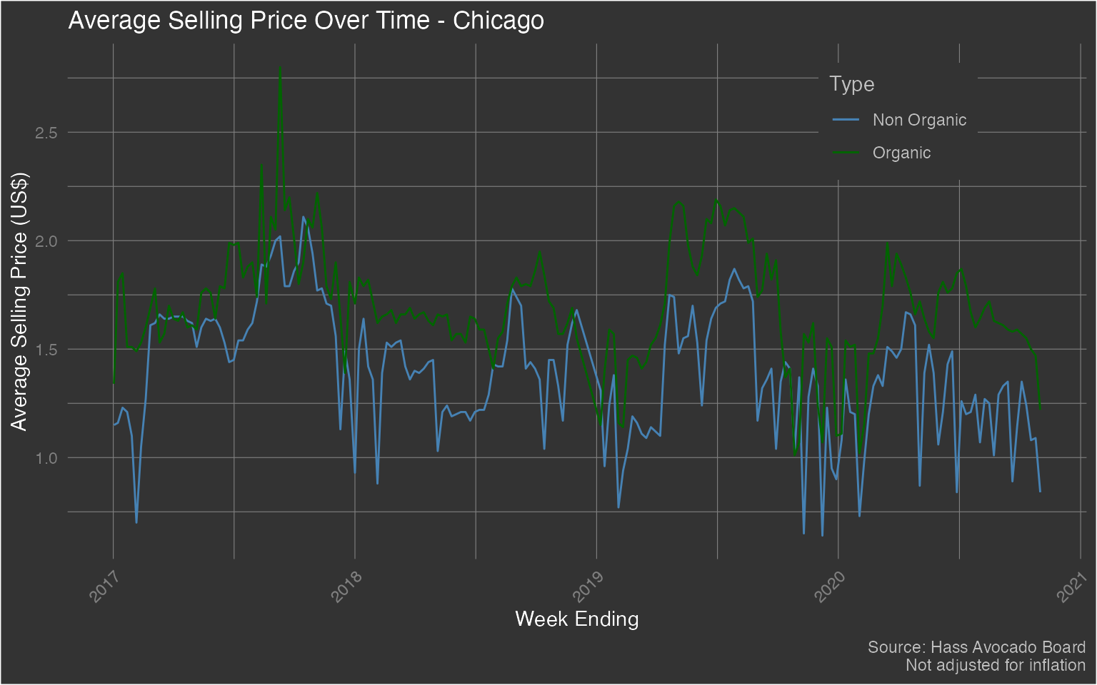
2017 does seem to have some peculiarities in terms of price. However, that can be attributed to a shortage in avocados. While this may seem a bit plain, let’s look at the total revenue for the other communities within the Great Lakes region and exclude Chicago - as it is a far larger city.
Total Revenue for Great Lakes Region without Chicago
hass %>%
  filter(region == 'Great Lakes' & location != 'Chicago') %>%
  mutate(
    year = lubridate::year(week_ending)
  ) %>%
  group_by(
    year, location
  ) %>%
  summarize(
    total_revenue = sum((avg_price_nonorg * (plu4046 + plu4225 + plu4770 + small_nonorg_bag + large_nonorg_bag + xlarge_nonorg_bag)) + (avg_price_org * (plu94046 + plu94225 + plu94770 + small_org_bag + large_org_bag + xlarge_org_bag))) / 1000000,
    .groups = 'drop'
  ) %>%
  ggplot(aes(x = year, y = total_revenue, group = location)) +
  geom_bar(aes(fill = location), color = 'white', stat = 'identity', position = 'dodge') +
  labs(x = "Year", y = 'Total Revenue (US$)', fill = 'Location', title = 'Total Revenue within Great Lakes Region', caption = 'Souce: Hass Avocado Board\nNot adjusted for inflation') +
  theme(plot.background = element_rect(fill = "grey20"),
  plot.title = element_text(color = "#FFFFFF"),
  axis.title = element_text(color = "#FFFFFF"),
  axis.text.x = element_text(color = 'grey50', angle = 45, hjust = 1),
  axis.text.y = element_text(color = 'grey50'),
  plot.caption = element_text(color = 'grey75'),
  panel.background = element_blank(),
  panel.grid.major = element_line(color = "grey50", size = 0.2),
  panel.grid.minor = element_line(color = "grey50", size = 0.2),
  legend.background = element_rect(fill = 'grey20'),
  legend.key = element_rect(fill = 'grey20'),
  legend.title = element_text(color = 'grey75'),
  legend.text = element_text(color = 'grey75')
  )
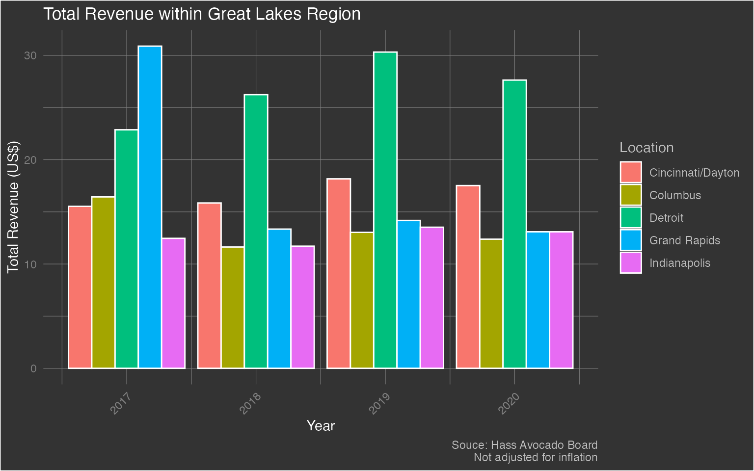
Now this is interesting! Grand Rapids had more total revenue than Detroit in 2017, but in the years following, it seemed to take a big hit in revenue!
Revenue by Month - Great Lakes
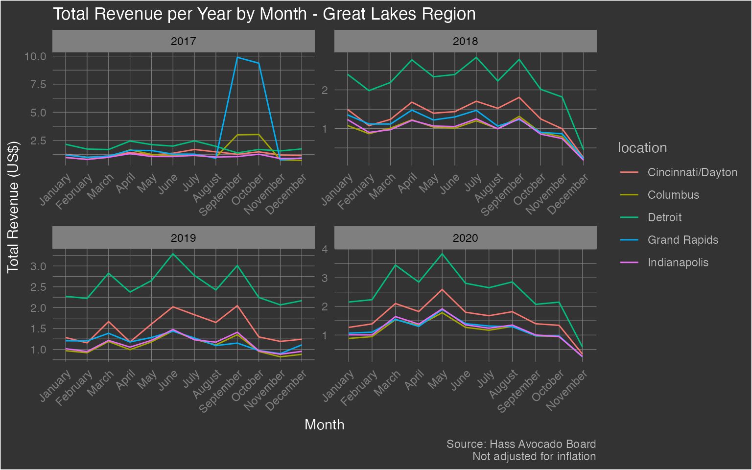
Perhaps it may be interesting to dive down into the monthly level for each year to see the total revenue. Is there a particular month that stands out? Once again, we’ll exclude Chicago. Let’s find out.
hass %>%
  filter(region == 'Great Lakes' & location != 'Chicago') %>%
  mutate(
    month = lubridate::month(week_ending, label = T, abbr = F),
    year = lubridate::year(week_ending)
  ) %>%
  group_by(year, month, location) %>%
  summarize(
    total_revenue = sum((avg_price_nonorg * (plu4046 + plu4225 + plu4770 + small_nonorg_bag + large_nonorg_bag + xlarge_nonorg_bag)) + (avg_price_org * (plu94046 + plu94225 + plu94770 + small_org_bag + large_org_bag + xlarge_org_bag))) / 1000000,
    .groups = 'drop'
  ) %>%
  ggplot(aes(x = month, y = total_revenue, group = location, color = location)) +
  geom_line() +
  facet_wrap(.~year, scales = 'free') +
  labs(fill = 'Location', x = 'Month', y = 'Total Revenue (US$)', caption = 'Source: Hass Avocado Board\nNot adjusted for inflation', title = 'Total Revenue per Year by Month - Great Lakes Region') +
  theme(plot.background = element_rect(fill = "grey20"),
        plot.title = element_text(color = "#FFFFFF"),
        axis.title = element_text(color = "#FFFFFF"),
        axis.text.x = element_text(color = 'grey50', angle = 45, hjust = 1),
        axis.text.y = element_text(color = 'grey50'),
        plot.caption = element_text(color = 'grey75'),
        panel.background = element_blank(),
        panel.grid.major = element_line(color = "grey50", size = 0.2),
        panel.grid.minor = element_line(color = "grey50", size = 0.2),
        legend.background = element_rect(fill = 'grey20'),
        legend.key = element_rect(fill = 'grey20'),
        legend.title = element_text(color = 'grey75'),
        legend.text = element_text(color = 'grey75'),
        strip.background = element_rect(fill = 'grey50'),
        strip.text = element_text(color = 'black')
  )
It seems as if the revenue declines in the winter months. This could be due to reduced supply and demand. On the other hand, during the late spring and summer months, revenue is at its highest. Maybe guacamole is a summer dish? Not for me!